
Choosing the correct chart for a dashboard is essential and should be guided by several key factors.
- Michael Davenport
- Sep 8, 2025
- 2 min read

One important key to small business analytics is selecting the appropriate chart for data visualization which depends on both the characteristics of the data and the target audience. It is important to consider the intended message and whether the information is being presented to management or stakeholders. These two charts, a waterfall chart and a line chart serve different purposes when considering your business’s dashboard.
A waterfall chart illustrates increases and decreases over a specified period, building sequentially to display changes in balance. This type of chart can identify variances in income and expenditures, highlight seasonality, and show cumulative effects throughout the period. Waterfall charts may also be used to represent the impact of multiple revenue sources is a sales report, especially when evaluated alongside marketing campaigns to assess customer response. They are applicable for tracking inflows and outflows to add details to inventory reporting and, when used with Key Performance Indicators (KPIs), can provide a summary of goals or performance ratios. Although waterfall charts can cover extended periods, their detailed presentation is most effective for shorter time frames.
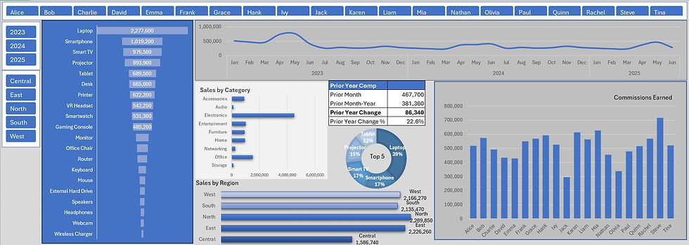
A line chart effectively illustrates trends over longer periods of time by representing continuous data. This format is particularly useful for analyzing sales, customer figures, or inventory levels as a net number. By emphasizing the temporal aspect of the information, a line chart provides viewers with a comprehensive perspective on historical patterns and enables informed forecasting based on visual trends. With an initial value as a reference point, the chart allows users to extrapolate future data points. As each line passes through a single value at a specific moment, aggregate figures such as net income, expenses, or inventory are represented. Consequently, line charts are well-suited to displaying information across extended periods where summarized data is preferred.
Selecting the appropriate chart for your business dashboard is a vital step in effectively tracking key metrics and guiding strategic decisions as part of your small business analytics. Much like a vehicle’s dashboard provides insights into speed and performance, a business dashboard offers valuable indicators that inform necessary operational adjustments to influence sales outcomes. Timely responses to changing market conditions can help minimize risk. One significant advantage of operating a small business is the ability to quickly modify inventory levels, launch promotions, and initiate marketing campaigns. Leveraging data empowers these processes and enhances decision-making. Thoughtful selection of dashboard charts ensures that the most relevant data informs your actions and supports business growth.
Comments